Flora Capital
Magazine Design Issues
The Challenge
A company magazine can easily become a brochure: product photos, corporate updates and text that few people read to the end. Flora wanted something people would actually pick up, keep and share. Each issue had to balance several kinds of content, from day-to-day operations and achievements to major product launches, while feeling like one consistent publication across issues.
What We Built
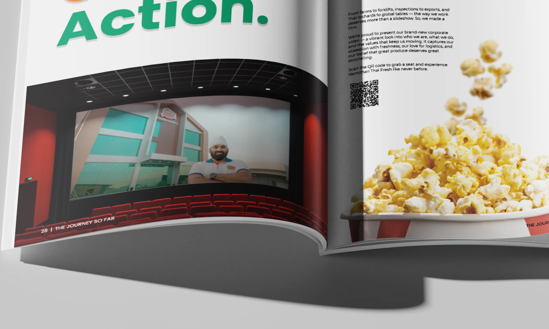
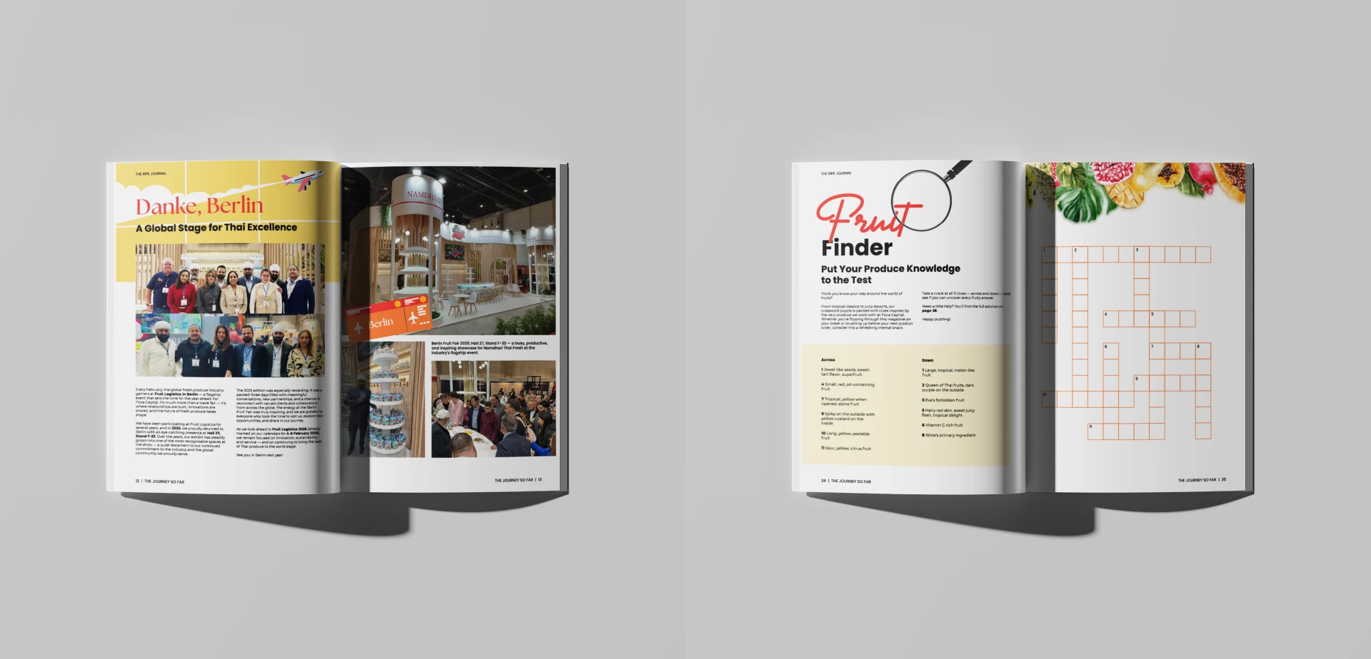
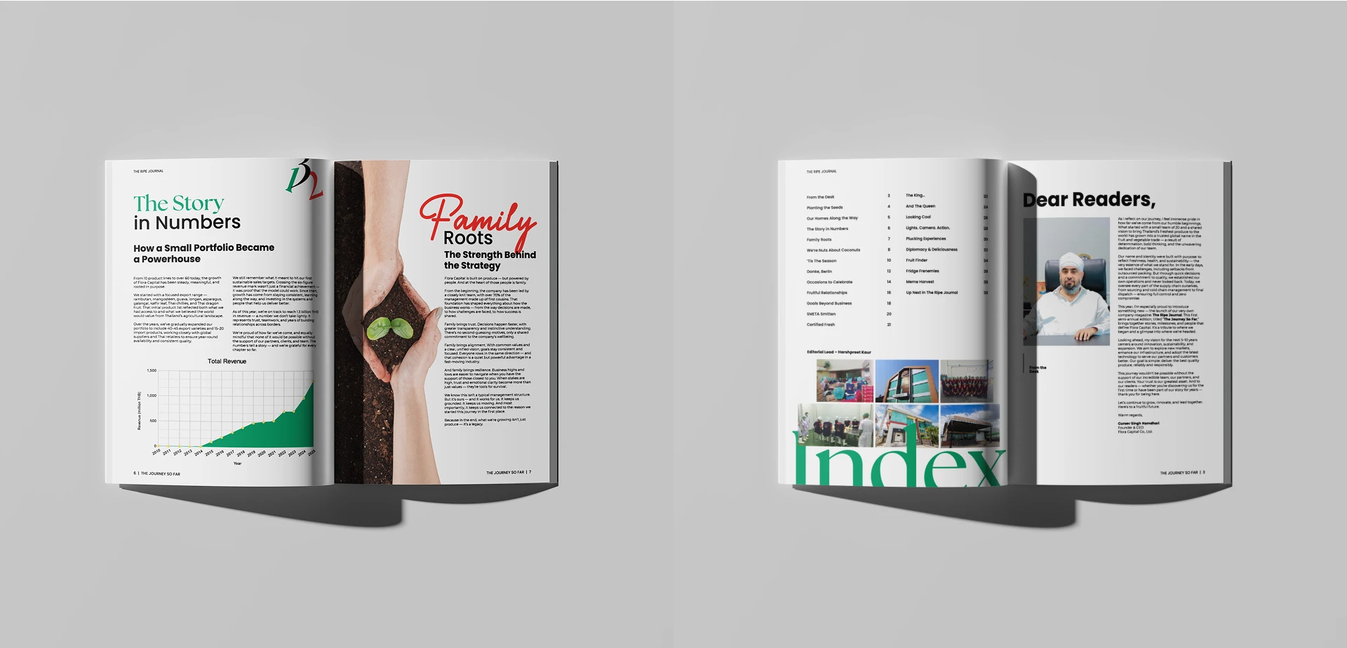
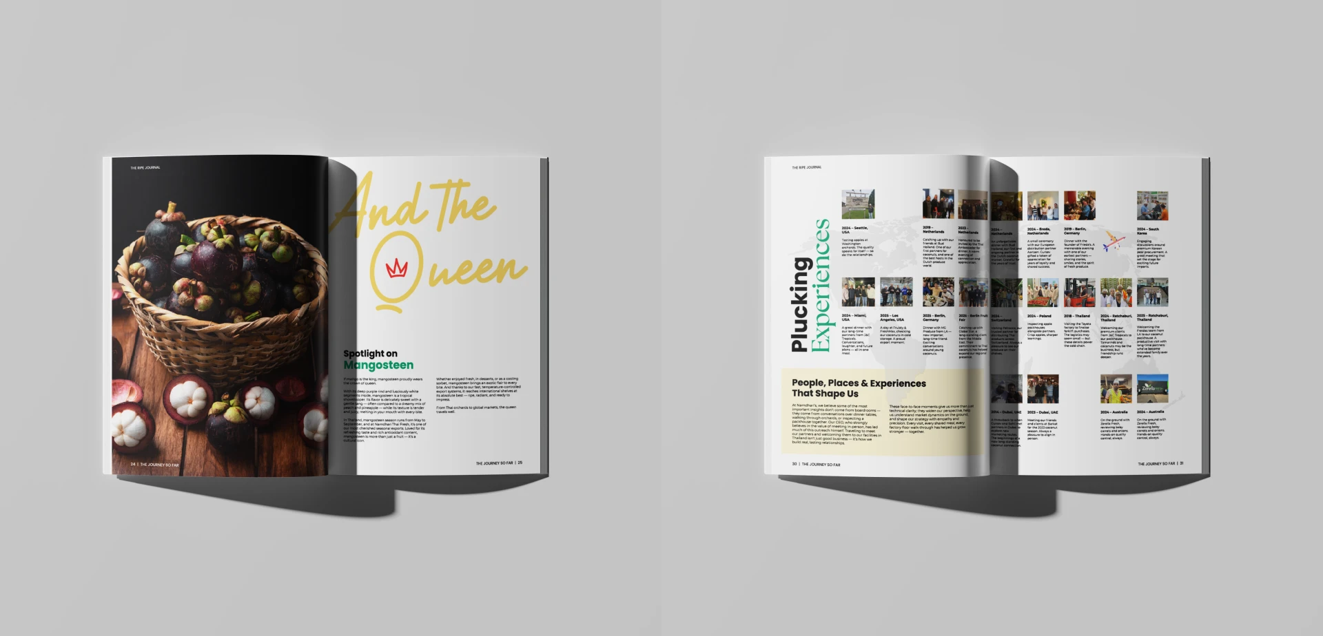
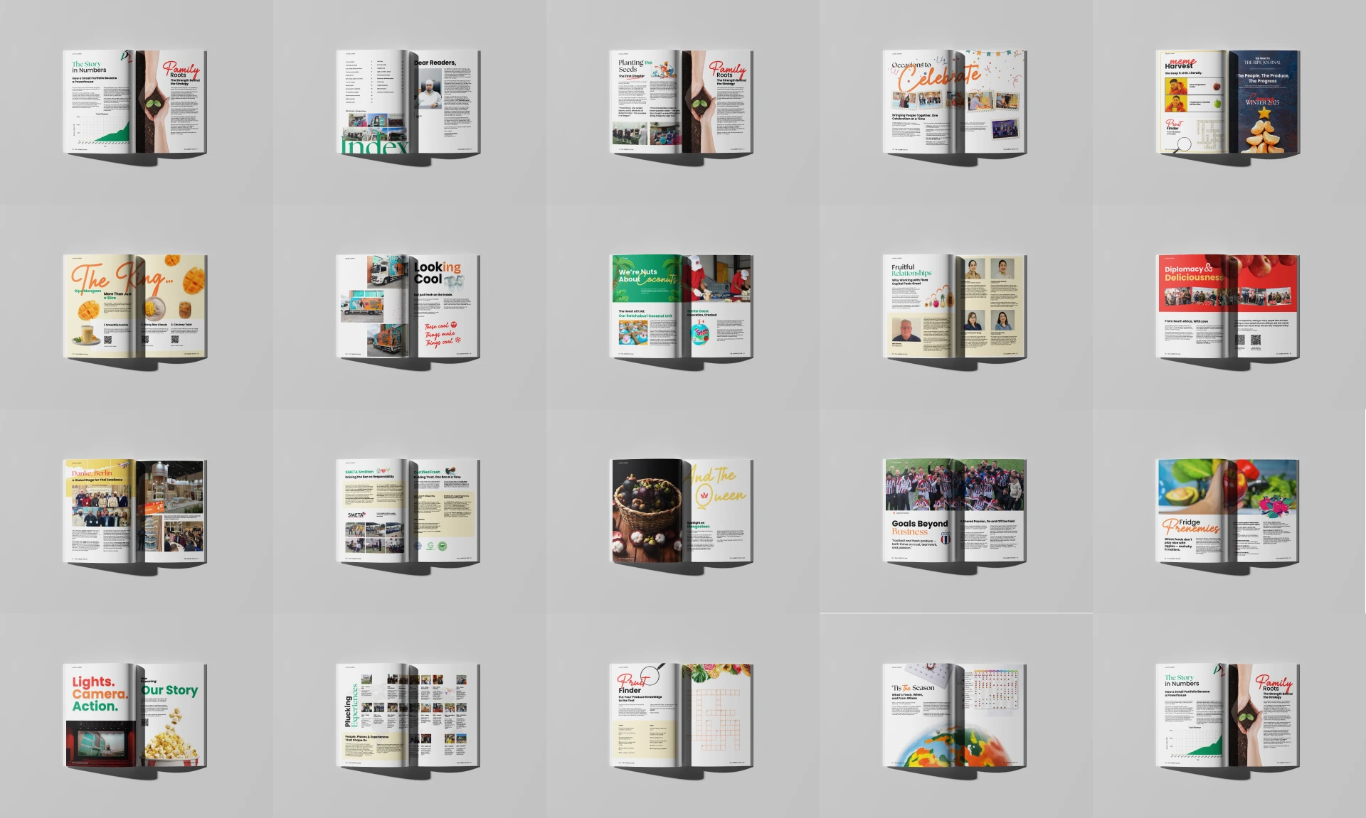
We created a clear, editorial design system for the magazine that could carry it from issue to issue. A consistent grid, typography and colour palette give every edition a recognisable identity, while each issue's cover and feature spreads bring fresh energy to its content.
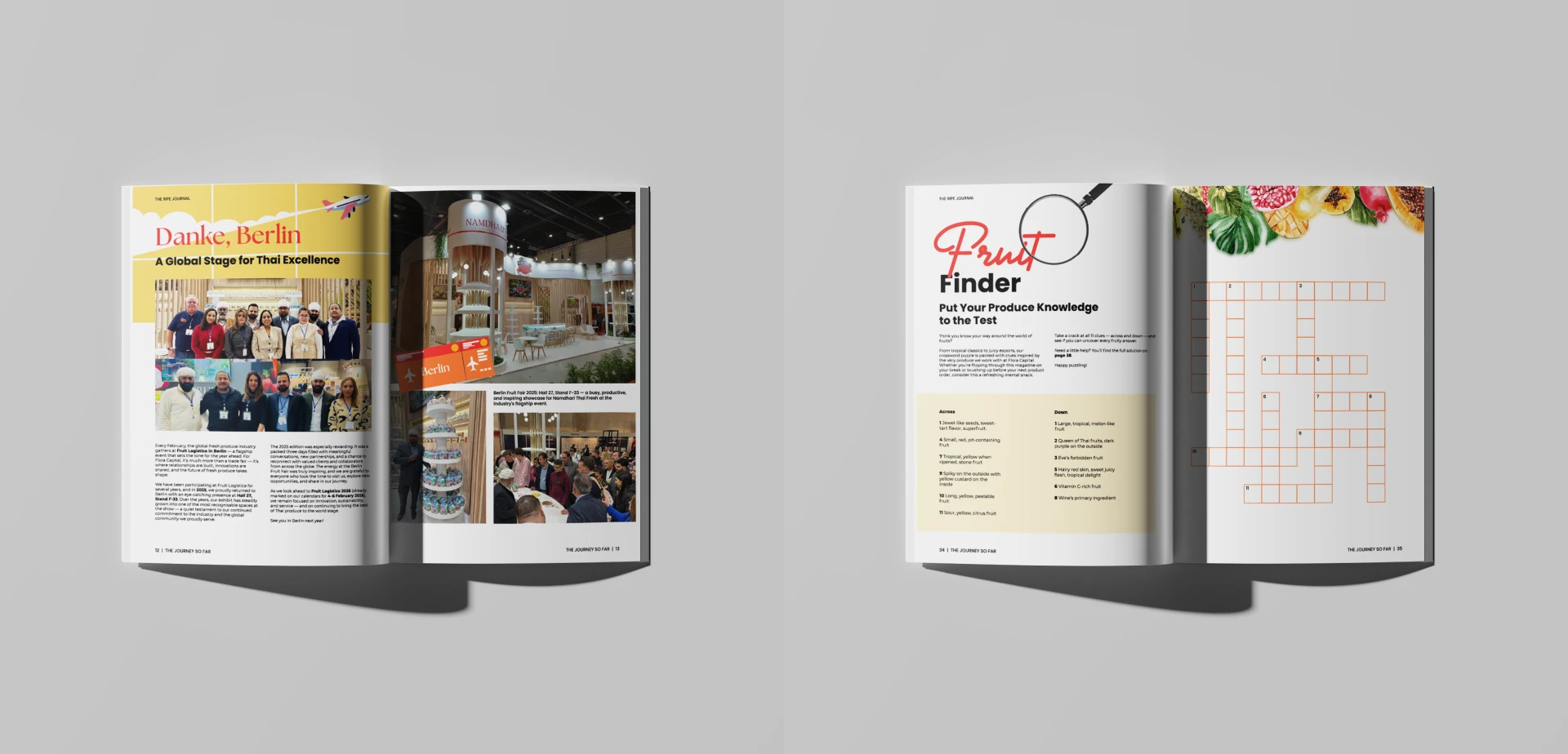
Inside, we designed the layouts to read like a real magazine rather than a company report. Stories about the team's work and achievements are given space to breathe, with strong photography, pull quotes and clear headings that make long articles easy to follow. Facts and milestones are presented visually through simple infographics and highlight sections, so key numbers stand out at a glance.
The launches of Flora's new fruit vending machines were treated as feature moments. We designed dedicated spreads that introduce each machine, show it in context and explain what makes it different, making the launch feel like news rather than an advertisement.
Across all three issues, we managed the full design process through to print-ready files, making sure colours, images and finishes reproduced accurately on paper.
The Result
Flora now has a print magazine that reflects the quality of its work. Each issue documents the company's growth, celebrates its achievements and gives new products a proper introduction. With three published issues, the magazine has become a consistent, recognisable part of the brand, something readers look forward to twice a year.