Ila
Branding, Visual Identity
The Challenge
Silver is a crowded and familiar category. Many brands rely on the same cues: generic script logos, heavy ornamentation or discount-led messaging. Ila needed to stand apart while still feeling trustworthy and timeless. The brand had to appeal to buyers looking for something meaningful, communicate quality before anyone touched a product and work consistently across packaging, social media, the website and in-store materials.
What We Built
We began with brand strategy. We defined who Ila is for, what it stands for and how it should feel: refined, warm and lasting. This gave us a clear positioning, brand values and a tone of voice that guided every design decision that followed.
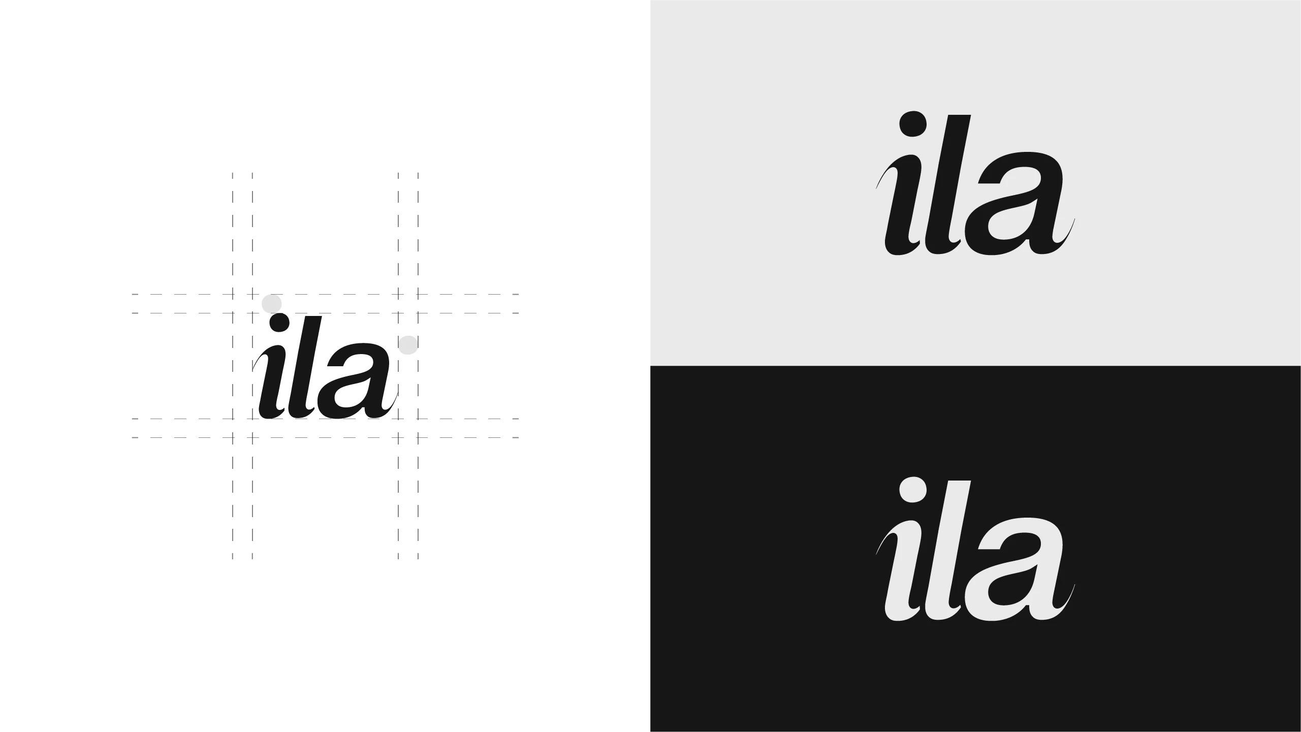
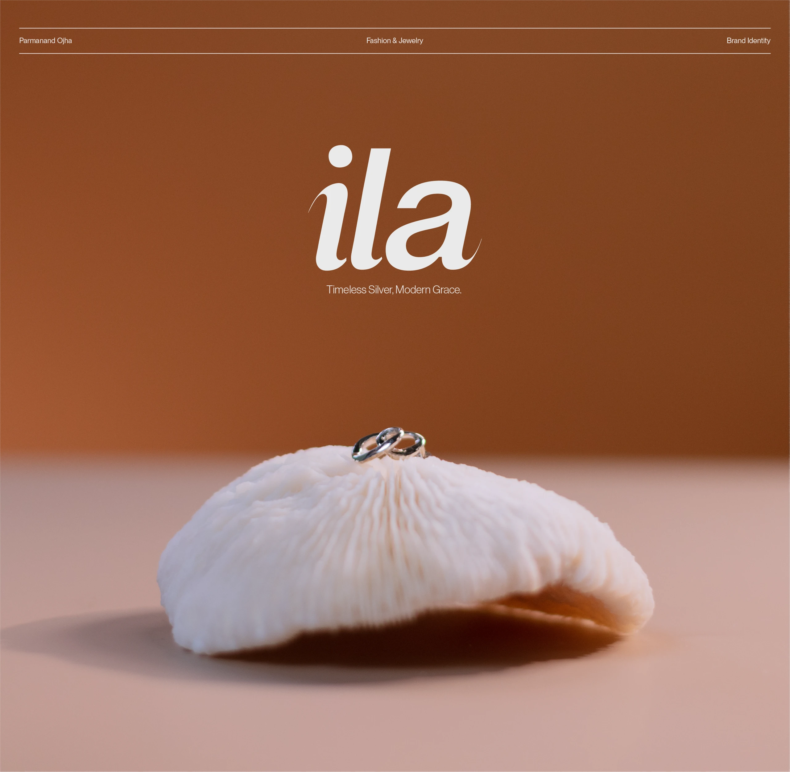
From there, we designed the logo. The mark was crafted to feel as considered as the silver itself, simple enough to be engraved, embossed or printed small, yet distinctive enough to be recognised at a glance. Clean lines and balanced proportions give it a quiet elegance that won't date quickly.
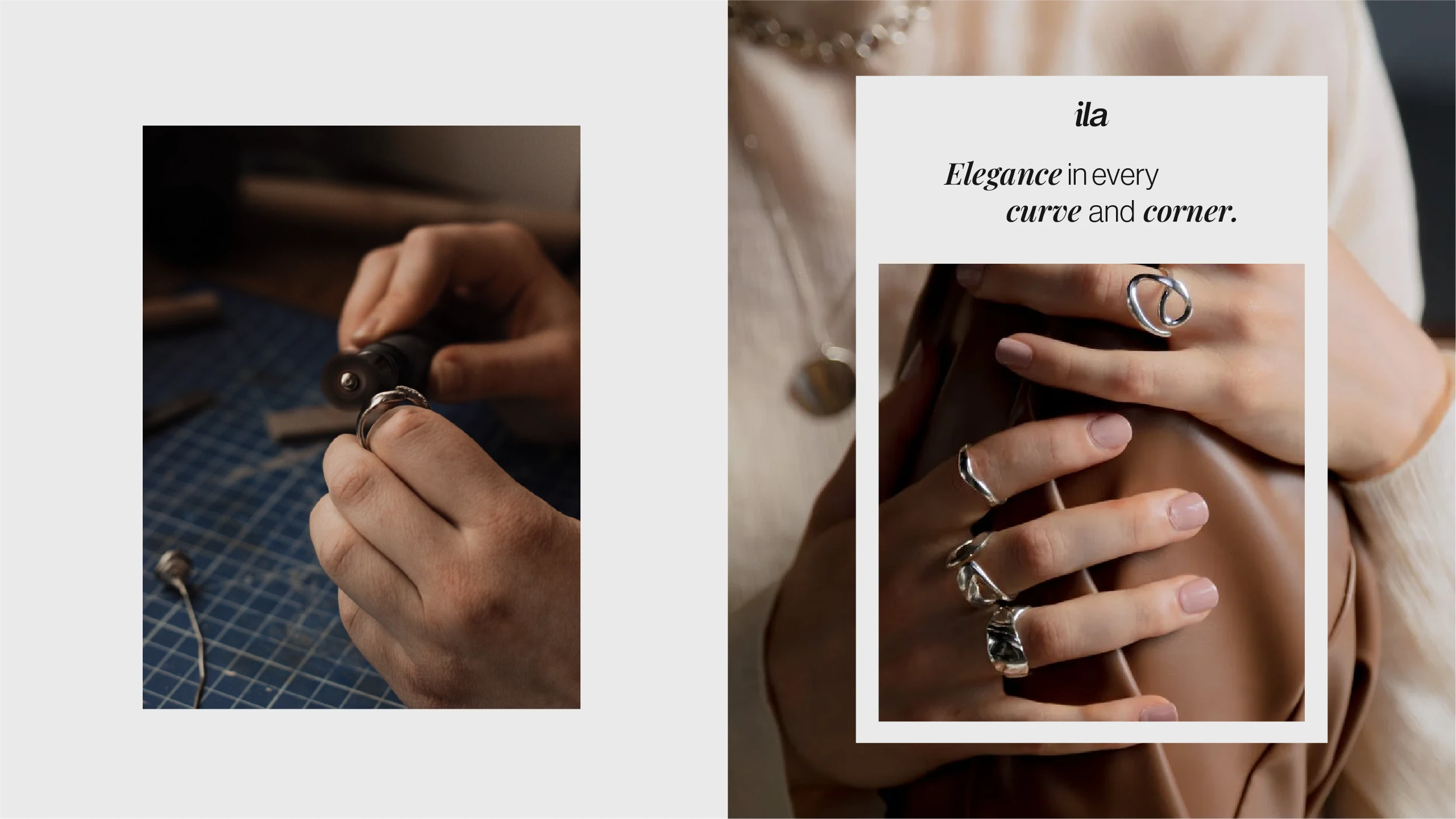
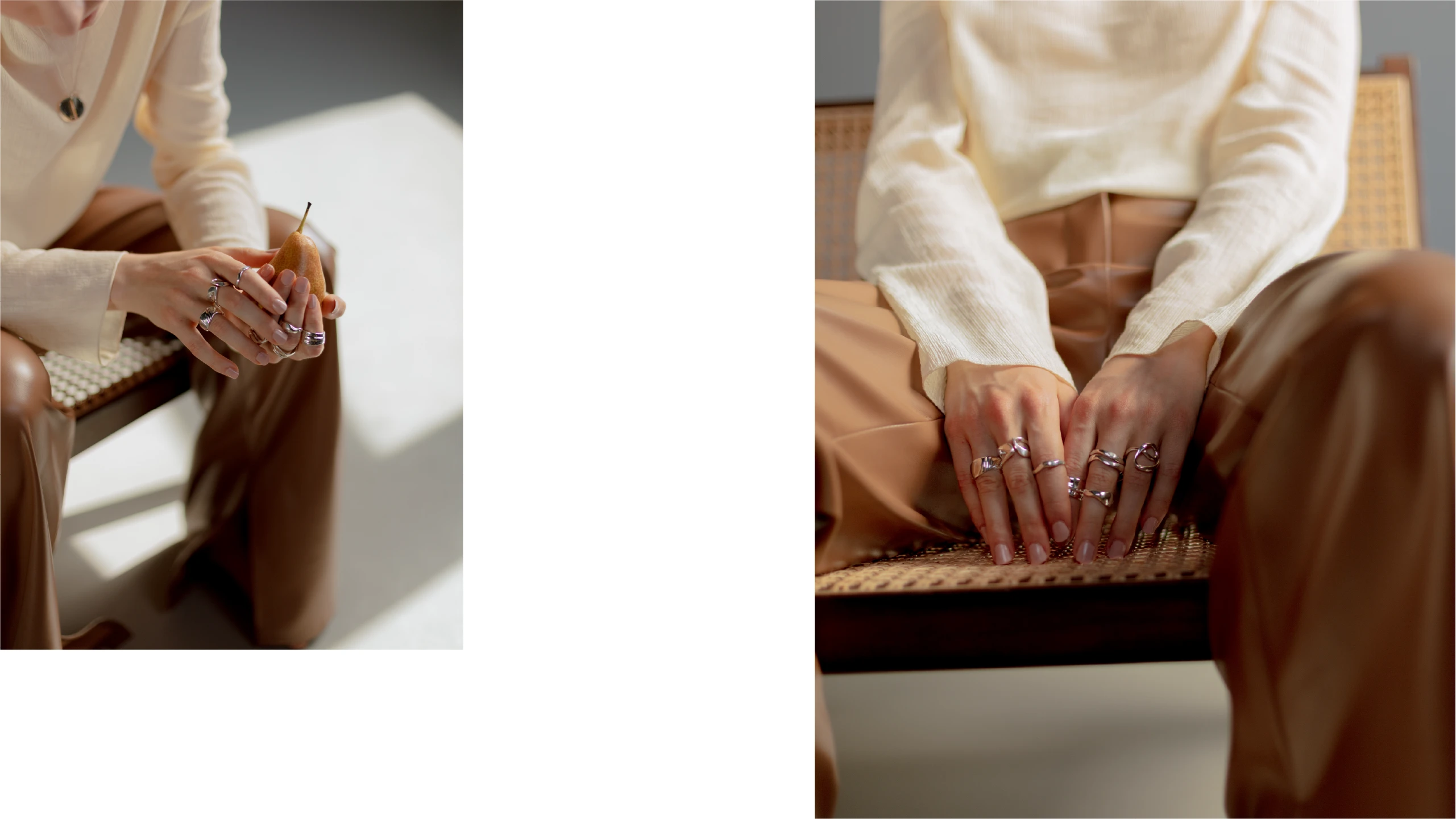
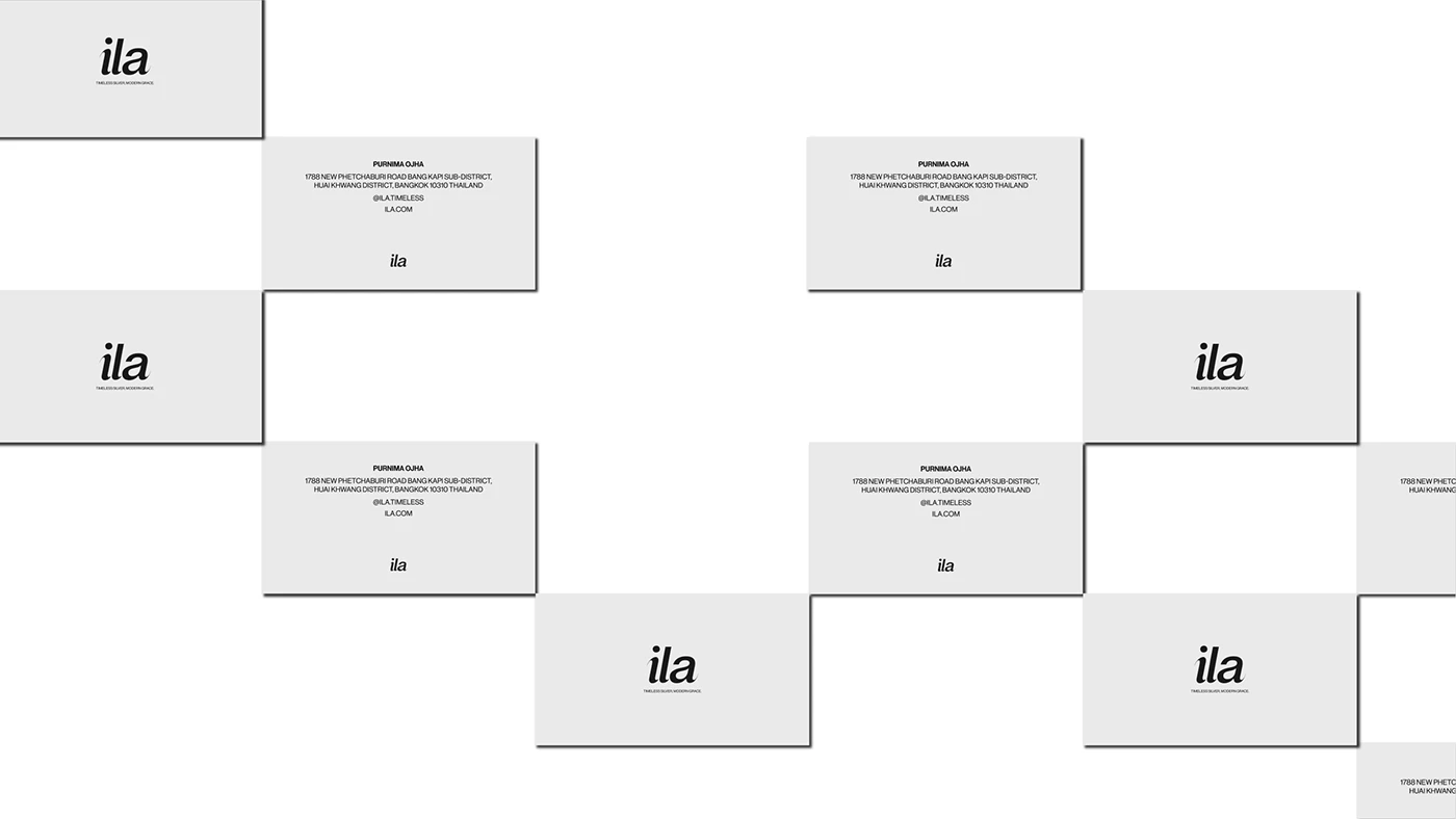
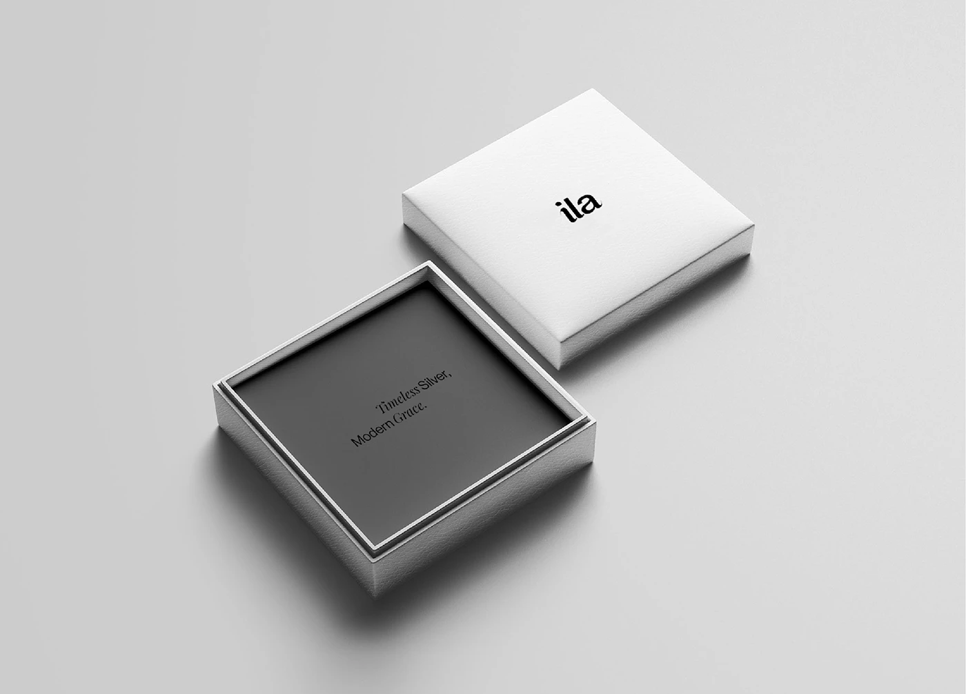
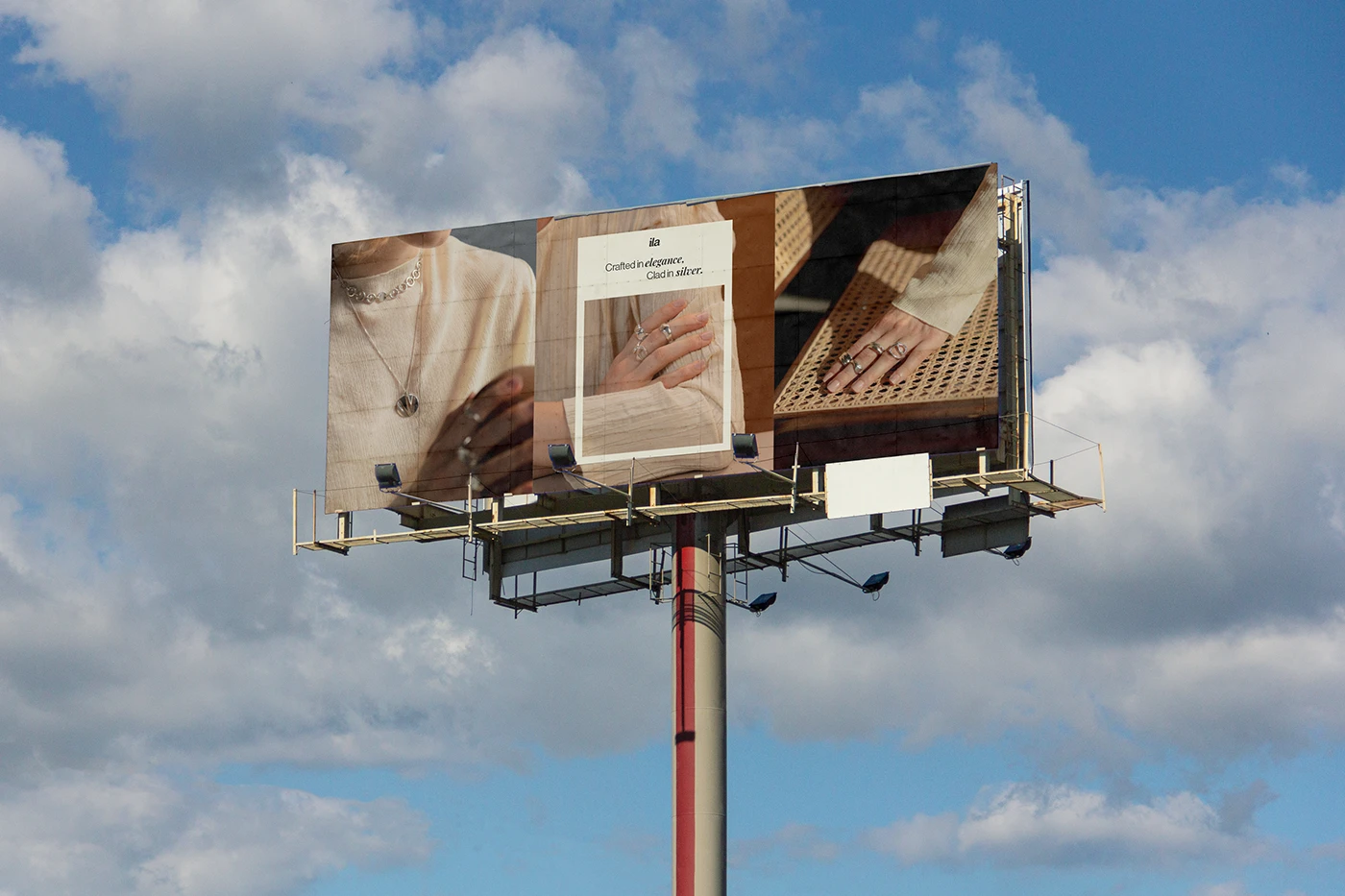
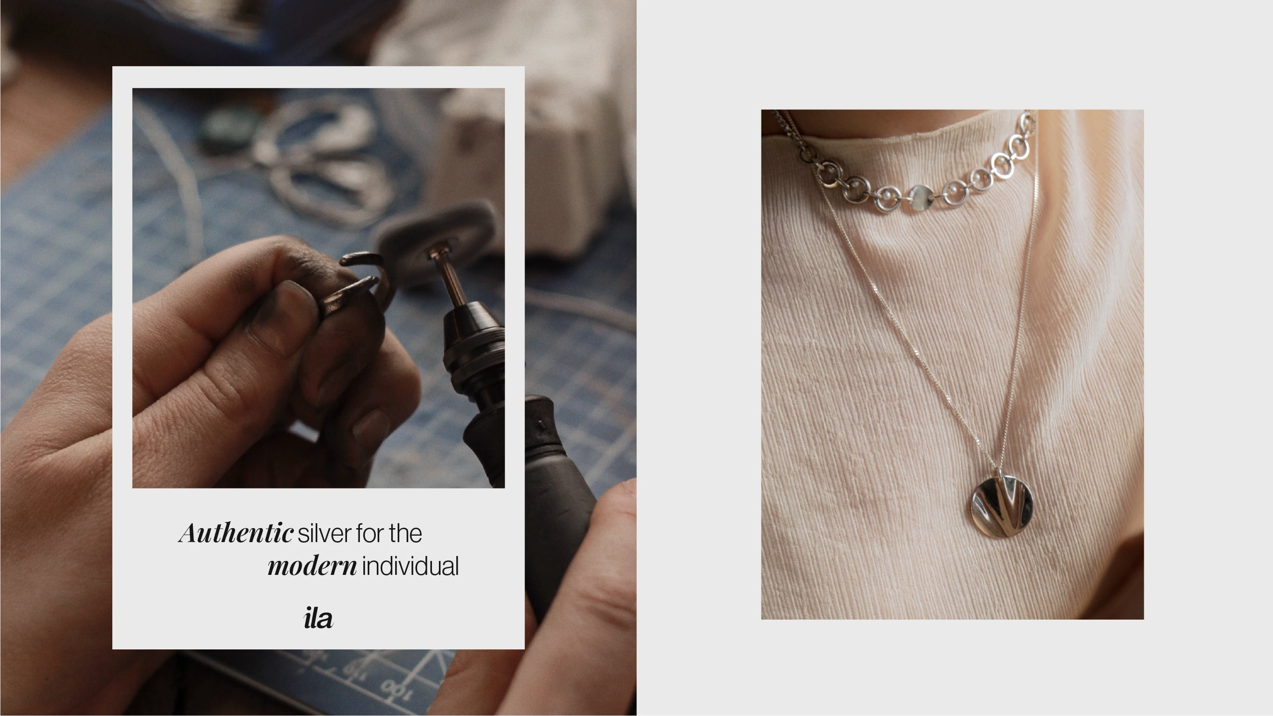
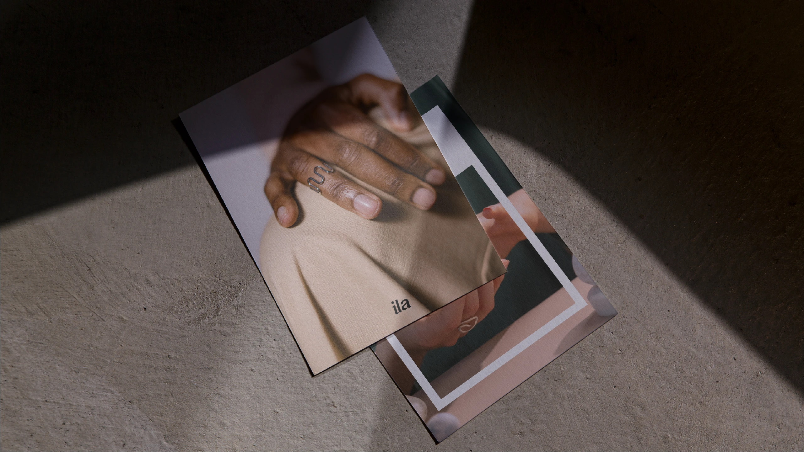
We then built the full visual identity around it. This included a colour palette inspired by the natural tones of silver, a typography system that pairs elegance with readability, and supporting graphic elements that add character without distracting from the products. We extended the identity across key touchpoints, including packaging, labels, social media templates and stationery, so every interaction with Ila feels part of the same story.
Everything was documented in brand guidelines, giving the team a clear reference for using the identity correctly as the business grows.
The Result
Ila now has a brand that matches the quality of what it sells. Its identity is cohesive, recognisable and built to last, giving customers a reason to trust and remember the brand, and giving Ila a strong foundation for growth.
Skills & Tools
Skills — Brand Strategy, Logo Design, Visual Identity, Packaging and Collateral, Brand Guidelines
Tools — Photoshop, Illustrator